Personal Website with HTML and CSS


Introduction
SO, Today i made the portfolio site again, but this time i added CSS.
I started with just the design on canva i made it in a 1400x800 canvas which i ended up regretting because i found out that my screen is actually longer than that...
It was too late to change at that point so i just winged it...
Hero page
- This is the first page we end up on when we enter the site.

This is the design i made on canva.
I soon realized that that corner was going to be a nightmare to make..
A lot of divs and a lot of value tweaking later it worked.
The frame with my name in it is made with three rectangles one in the other with different colours and centered using flexbox.
I made the overall layout using grid.
I write my name in a sans serif font and the line below it in sans-serif.

This is the layout I ended up with its not the exact same but it works.
I didnt get the exact same fonts either but it is from the same family.
<div class="hero">
            <div class="corner">
                <div class="bar maroon one">
                </div>
                <div class="bar brown two">
                </div>
                <div class="bar blue three">
                </div>
                <div class="bar brown four">
                </div>
                <div class="bar blue five">
                </div>
                <div class="bar maroon six">
                </div>
            </div>
            <div class="frame outer">
                <div class="frame mid">
                    <div class="frame inner">
                        <h1 class="name">Manmohan</h1><br/>
                        <p class="phrase">Friendly neighbourhood programmer</p>
                    </div>
                </div>
            </div>
        </div>
.hero{
    display: grid;
    grid-template-columns: 214px 500px 40px 1000px;
    grid-template-rows: 314px 331px;
    background-color: #FF204E;
    height:768px;
    width:100%;
    margin: 0px;
}
.corner{
    background-color: #FF204E;
}
.bar{
    position: relative;
    transform: rotate(135deg);
}
.maroon{
    background-color: #5D0E41;
}

.brown{
    background-color: #A0153E;
}

.blue{
    background-color: #00224D;
}

.one{
    top:5px;
    left:-34px;
    height: 30px;
    width: 154px;
}
.two{
    top : -110px;
    left: 0px;
    height: 13px;
    width: 150px;
    z-index: 1;
}
.three{
    top : -93px;
    left: -41px;
    height: 19px;
    width: 200px;
}
.four{
    top:-50px;
    left: -45px;
    height: 19px;
    width: 200px;
    z-index: 1;
}
.five{
    top:-180px;
    left:85px;
    height: 50px;
    width: 200px;
}
.six{
    top:-80px;
    left:-150px;
    height: 25px;
    width: 500px;
}
.outer{
    display: flex;
    justify-content: center;
    align-items: center;
    grid-area: 2 /3/3/5;
    background-color: #00224D;
}
.mid{
    display: flex;
    justify-content: center;
    align-items: center;
    background-color: #5D0E41;
    height: 290px;
    width:990px;
    grid-area: 2/3/3/5;
}
.inner{
    display: flex;
    flex-direction: column;
    column-gap: 0px;
    background-color: #FF204E;
    height: 270px;
    width: 970px;
}

.name{
    font-size: 80px;
    letter-spacing: 5px;
    font-family: "Oswald", sans-serif;
    font-optical-sizing: auto;
    font-weight: 300px;
    font-style: normal;
    margin-left: 40px;
    margin-top: 25px;
    margin-bottom: 0px;
}
.phrase{
    margin :0px;
    font-size: 40px;
    font-weight: 900;
    margin-left: 40px;
    margin-top: 0px;
    font-family: "Libre Baskerville", serif;
    font-weight: 400;
    font-style: normal;
}
- That's all the code for that page.
Hello
- I didn't know what to call this page so i called it hello because that where i say hello.
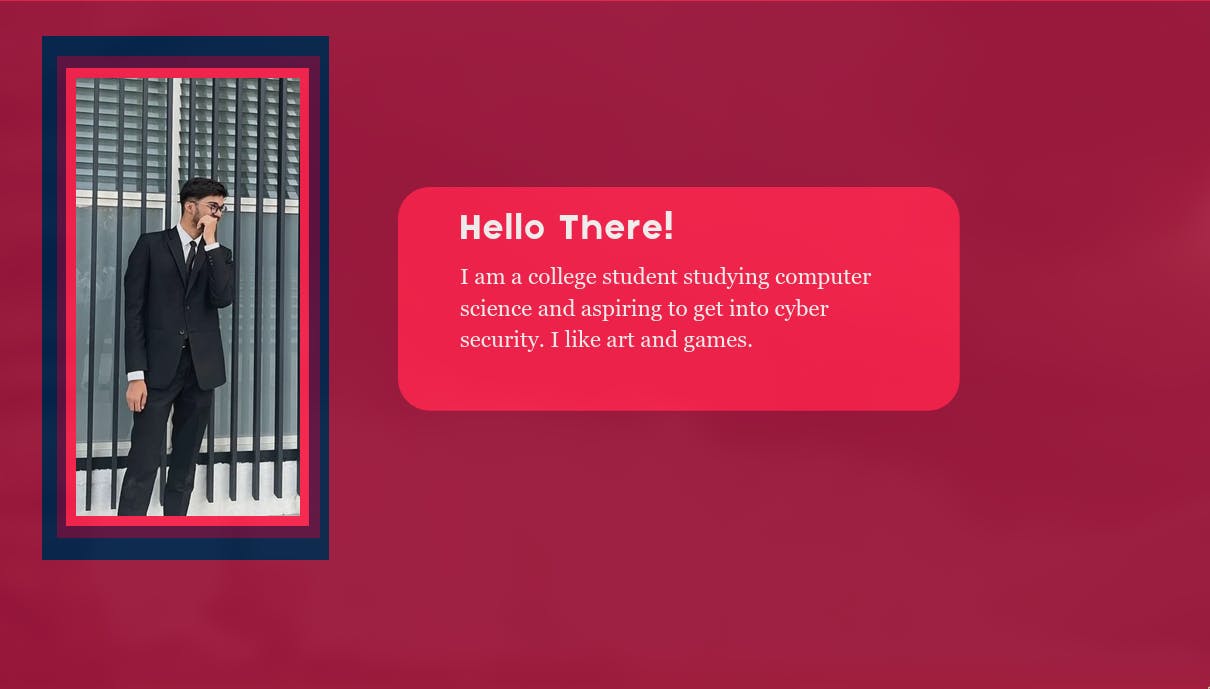
This was the design I made for this page .
I used grid for this page as well.
Now, that i think about it I could have used flexbox.
the frame is the same kind i used before and the card i made with a simple coloured div.

- This is the design i ended up with.
           <div class="frame outer">
                <div class="frame mid">
                    <div class="frame inner">
                        <h1 class="name">Manmohan</h1><br/>
                        <p class="phrase">Friendly neighbourhood programmer</p>
                    </div>
                </div>
            </div>
        </div>
        <div class="hello">
            <div class="out">
                <div class="m">
                    <div class="i">
                        <img src="./resources/images/me.jpg" alt="my picture in a suit" class="self-pic">
                    </div>
                </div>
            </div>
            <div class="box">
                <h2 class="sub-title">Hello There!</h2>
                <p class="text">I am a college student studying computer science and aspiring to get into cyber security. I like art and games.</p>
            </div>
        </div>
.hello{
    display: grid;
    grid-template-rows: 50px 200px 250px 200px 100px;
    grid-template-columns: 80px 300px 100px 600px 200px;
    background-color: #A0153E;
    height:768px;
    width: 100%;
    margin: 0px;
}
.out{
    display: flex;
    justify-content: center;
    align-items: center;
    background-color: #00224D;
    grid-area: 2/2/5/3;
}
.m{
    display: flex;
    justify-content: center;
    align-items: center;
background-color: #5D0E41;
width:95%;
height: 95%;
}
.i{
    display: flex;
    justify-content: center;
    align-items: center;
    background-color: #FF204E;
    height: 95%;
    width: 95%;
}
.self-pic{
    height: 95%;
    width: 95%;
    object-fit: cover;
}
.box{
    background-color: #FF204E;
    border-radius: 30px;
    grid-area: 3/4/4/6;
}
.sub-title{
    letter-spacing: 5px;
    font-family: "Oswald", sans-serif;
    font-optical-sizing: auto;
    font-weight: 300px;
    font-style: normal;
    margin-left: 40px;
    margin-top: 25px;
    margin-bottom: 0px;
    font-size: 40px;
    color: #ffffff;
}
.text{
    font-family: "Libre Baskerville", serif;
    font-weight: 400;
    font-style: normal;
    margin-left: 40px;
    margin-top: 25px;
    margin-bottom: 0px;
    font-size: 20px;
    color: #ffffff;
}
- This is all the code.
Skills
- Here I try to list my skills.
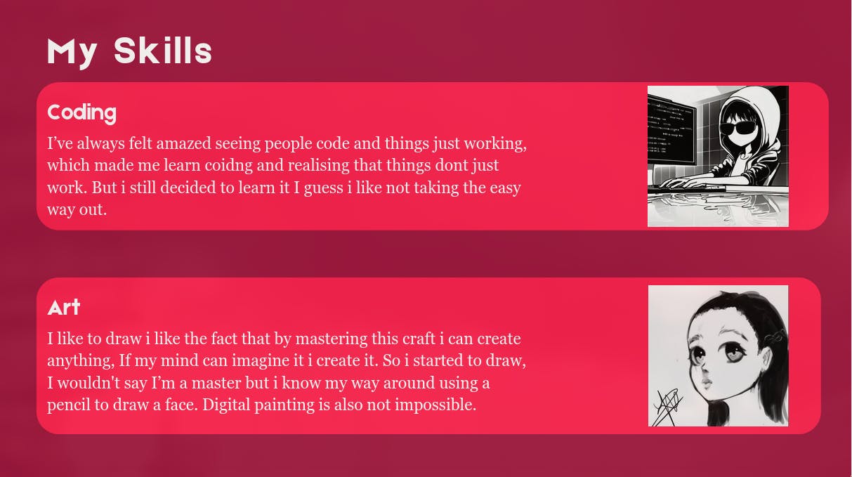
- This is the design i came up with on canva i decided to make this using a column flexbox with 3 divs.

- I made the images float right and added margins on the right and bottom to get it to the right position.
<div class="skills">
            <div><h2 class="sub-title skill">My Skills</h2></div>
            <div class="skill-block one">
                <h3 class="sub-title sub">Coding</h3>
                <img src="./resources/images/coding anime boy black and white.jpg" alt="sunglasses typeing something cartoon" class="skill-img">
                <p class="text sk">I’ve always felt amazed seeing people code and things just working, which made me learn coding and realising that things dont just work. But i still decided to learn it I guess i like not taking the easy way out.</p>
            </div>
            <div class="skill-block two">
                <h3 class="sub-title sub">Art</h3>
                <img src="./resources/images/240421_22h41m45s_screenshot.png" alt="drawing of my oc kiyo" class="skill-img">
                <p class="text sk">I like to draw i like the fact that by mastering this craft i can create anything, If my mind can imagine it i create it. So i started to draw, I wouldn't say I’m a master but i know my way around using a pencil to draw a face. Digital painting is also not impossible.</p>
            </div>
        </div>
.skills{
    display: flex;
    flex-direction: column;
    justify-content: center;
    background-color: #A0153E;
    height:768px;
    width: 100%;
    margin: 0px;
}
.skill{
    margin-left:85px
}
.skill-block{
    display: inline;
    background-color: #FF204E;
    margin-left: 70px;
    margin-top: 30px;
    border-radius:30px ;
    height: 30%;
    width: 90%;
}
.two{
    margin-top: 80px;
}
.sub{
    font-size: 30px;
    margin-left: 15px;
    letter-spacing: 1px;
}
.sk{

    margin-left: 15px;
    width: 70%;
}
.skill-img{
    height: 80%;
    float: right;
    margin-right: 30px;
    margin-top: -48px;
}
- And again thats all the code.
Footer
- And finally i added a section where i added links to my github linkedin and twitter.

- This was the design on canva, which i then decided to make using a flexbox with a nested flexbox in it.
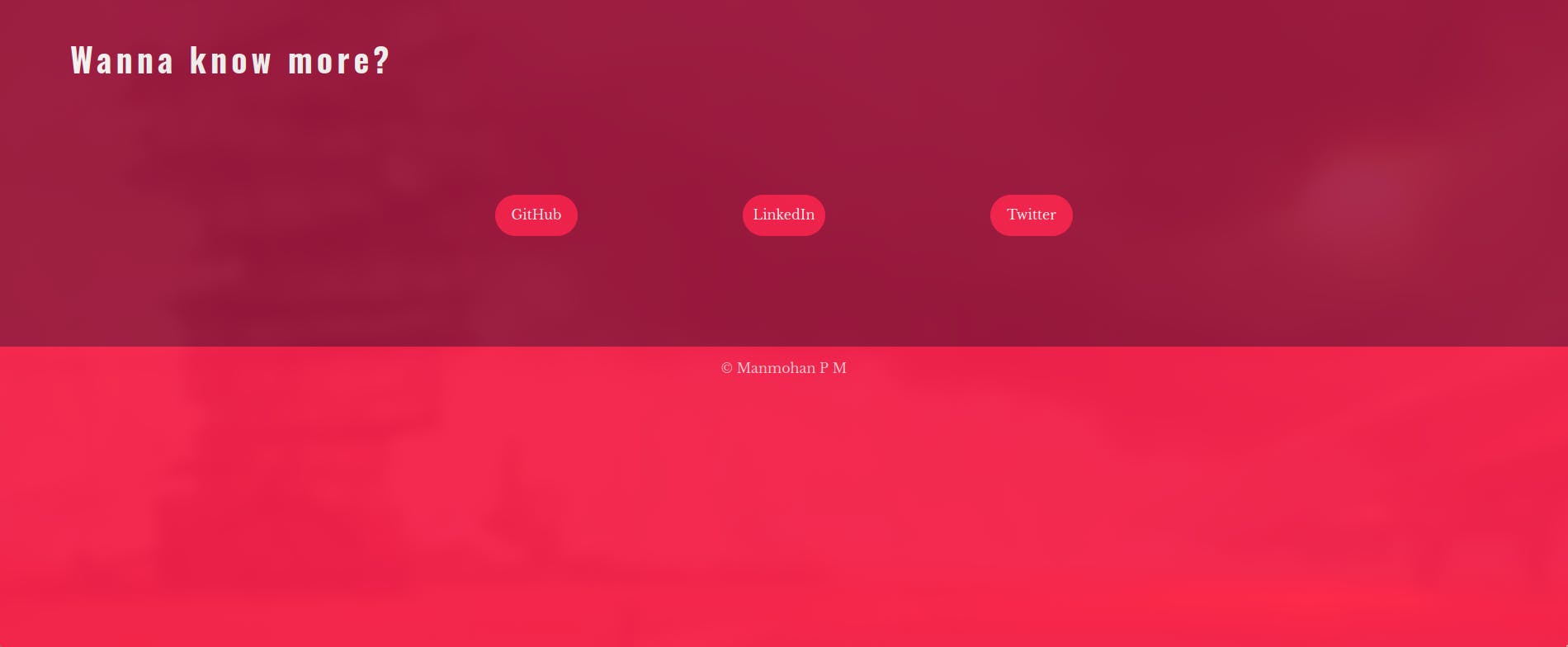
- This is the design i ended up with I changed the alignment of the heading because i thought it would be better to keep the alignment consistent.
<div class="footer">
    <div>
        <h2 class="sub-title more">Wanna know more?</h2>
    </div>
    <div class="links">
        <a href="https://github.com/P-M-Manmohan" class="button">GitHub</a>
        <a href="https://www.linkedin.com/in/manmohan-p-m-78618323a/" class="button">LinkedIn</a>
        <a href="https://twitter.com/Manmohan652" class="button">Twitter</a>
    </div>
    <div class="pink-part">
         <p class="copyright">© Manmohan P M</p>
    </div>
</div>
.footer{
    display: flex;
    flex-direction: column;
    background-color: #A0153E;
    height:768px;
    width: 100%;
    margin: 0px;
}
.more{
    margin-left: 85px;
}
.links{
    display: flex;
    justify-content: center;
    align-items: center;
    height: 50vh;
}
.button{
    display: flex;
    justify-content: center;
    align-items: center;
    font-family: "Libre Baskerville", serif;
    font-weight: 400;
    color: #ffffff;
    text-decoration: none;
    font-style: normal;
    background-color: #FF204E;
    height: 50px;
    width:100px;
    border-radius: 30px;
    margin-left: 100px;
    margin-right: 100px;
}
.pink-part{
    display: flex;
    justify-content: center;
    background-color: #FF204E;
    height: 70%;
}
.copyright{
    font-family: "Libre Baskerville", serif;
    font-weight: 400;
    font-style: normal;
    color: #ffffff;
    opacity: 0.8;
}
- And that is the code.
Conclusion
So that is the first website i made. I learnt to do this from Angela Yu in her course from udemy.
I made progress and im not stopping any time soon.
any advice on how to made this look better or how to make the code more efficient would be much appreciated.
github -> https://github.com/P-M-Manmohan
The website -> https://p-m-manmohan.github.io/personal-website/